assighment 2_Case study of Data Visualization
Example 1
This beautiful graph is made by Nathan Yau to visualize a 24-hour snapshot for a day in the life of Americans. Each ring represents an activity with a color. More dots means a greater percentage of people doing the respective activity during a certain time of day. (https://flowingdata.com/2021/08/25/cycle-of-many/)
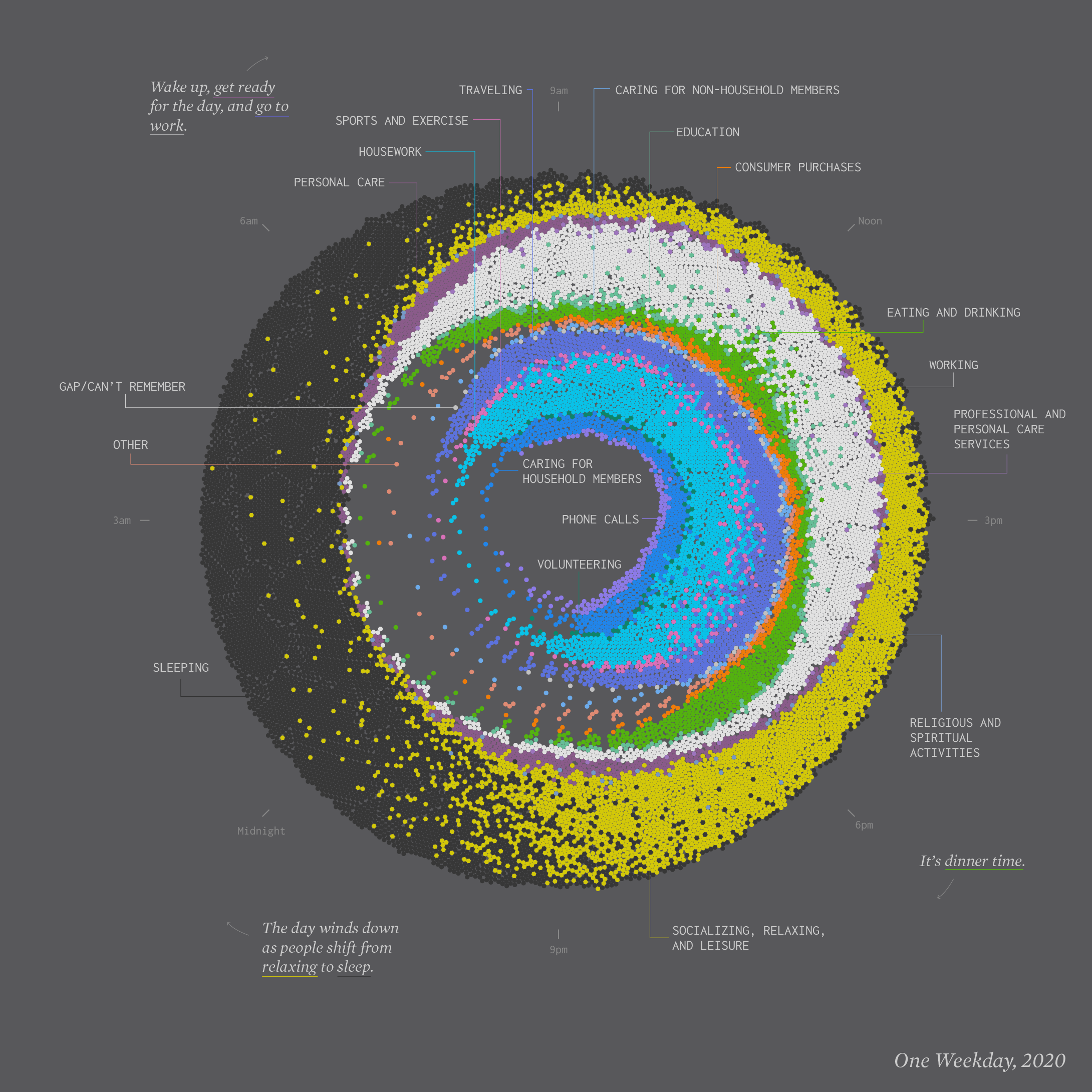
It's a poetic graph that it gives the viewer the sense of fragmented life when we look at the loosely organized dots. The contrasted yellow and dark grey give us a quick understanding of two opposite activities dominents two ends of a day. The yellow indicates engeretic. The dark grey indicates static and calmness. We also notice there are inner and outter rings in the graph.
When I try to fully understand the content, I found difficulties. The reasons can by found in the data and idiom it used.
idiom:
-
The idiom choosen here is an artistic version of a combination of donut chart and stacked bar charset. It's a good choice that the design use the circle diagram to demostrate 24-hour. But 9pm is on the top rather than 12pm, which is the standard setup of a clock.
-
The most promiment color in the graph is "leisure". Why this should be most prominent? Does leisure plays the most important role in our daily life? If this not the case, then what is the color logic?
data:
-
The designer want the inner ring data to be activities relate to home, and outters relate to work. But if we look the activites closely, we can see that there are so many detailed activites, but not catagoried enough. For example, is "leisure" more outter than "work"? Why "spiritual activites" are between "work" and "leisure"? The activites need to be better catagorized and located.
Improvement:
-
Rotate the circle so that 12pm is on the top. The overall circle aligns with the layout of a real clock. In this way, people will quickly get an impression of the daily activity distribution according to time.
-
Give a color system to the activites according to certain catagory structure, rather than using random discrete colors.
-
Re-sort the data of activites into certain catagory structure, that help people understand their behaviors.
-
Locate the activites in different layers of the ring accordingly to their degree of "intimacy".
Example 2
The graph below is a data Visualization of what makes peopel happy. Researchers asked 10,000 participants to list ten things that recently made them happy. The result was HappyDB, a collection of 100,000 happy moments. For each moment, the designer parsed out the subject, verb, and object to better see what makes people happy overall. (https://flowingdata.com/2021/07/29/counting-happiness/)
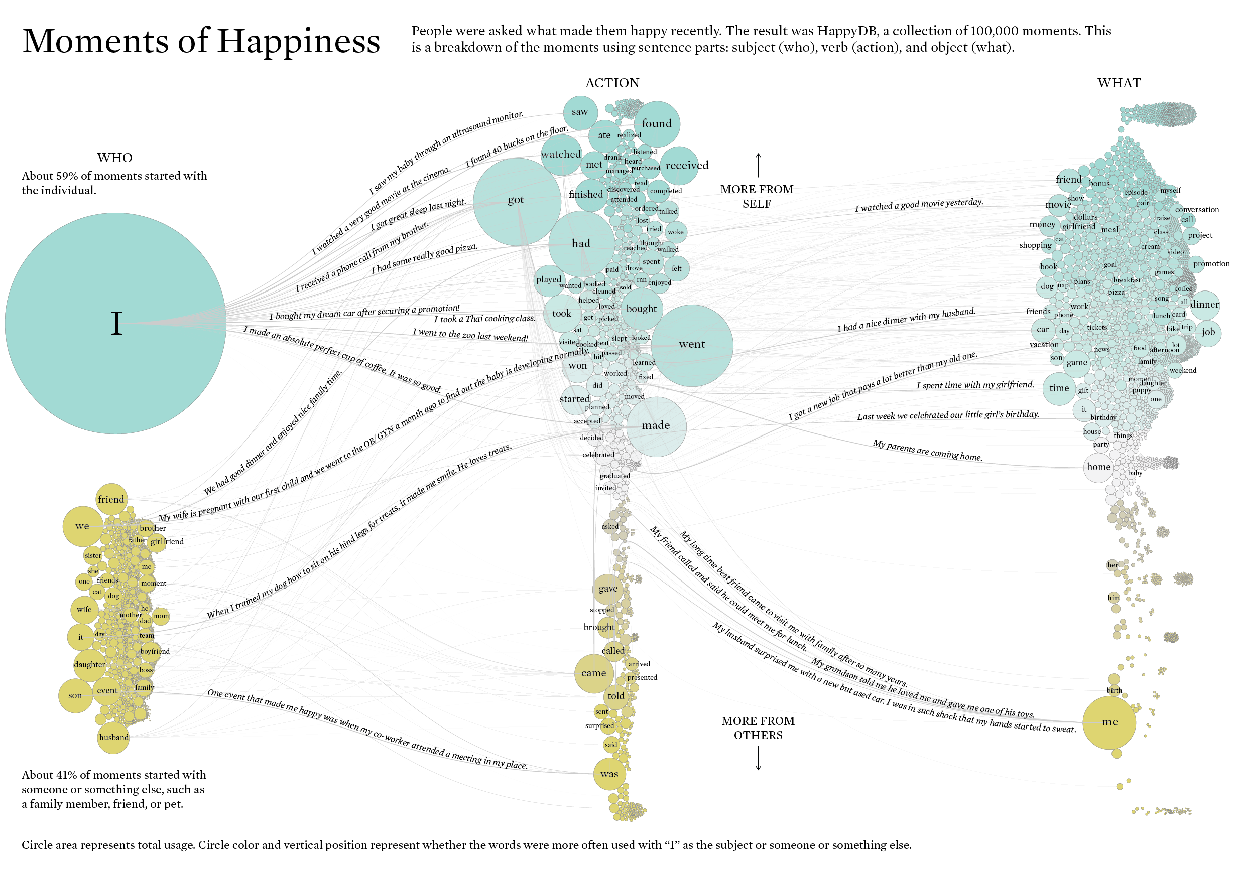
It seems like a very interesting project at first glance.The data visualization successfuly suggests that people's happiness are relate to individual activites, as we can see a very big circle "I" in the canvas. Then we notice there are two groups of circles away from each other, the "I" group and "small barbles" group, and are in different colors. What does it mean? It took me quite a bit of time to understand the graph.
The idiom choosen in this task is a Sankey chart, which is a visualisation technique that allows to display flows. The difficulty of reading the information from the graph can be analysised through it choice of data and idioms.
Idiom:
-
The gragh is colored into two groups in order to make a statement that "I" is the biggest subject relates to people's happyness. It losted the objectiveness when this is decided by the designer, rather than relating the color system to the quantity of the data.
-
The circles of the "others" are randomly layout. It doesn't make any statement rather than they are smaller.
-
The curves linking the circles suppose to show the relativeness of the items, as well as the connectivity. But the curves are too weak to suggest connectivity in the visual aspect.
data:
-
When the author split the data into "subject, verb, and object", there are overlap verbs in the "I" catalog and "others" catalog. Or say there are "common verbs" in this analysis. But this common data is not cataloged individually. So later when the three catalogs are linked together, the linking relationship is wrong.
-
In the verbs sector, this some text and arrow indicates the relationship of the data on the top vervus the data at the bottom: The data on the top are more relate to "self", while the data on the bottom are "more from others". The degree of "more" is ambigurious. Does it mean those data are split from sentence relating to others? What is the degree of "more" defines?
-
Another issue with verb sector data is quite foundamental: some verb, for instance "go" and "get", are more used than others because certain language nature. If the intension here is to illustrate the intensity to reflect people's preferences, then, this issue would heavily affact the result.
-
For the "object" part of data, If we differenciate them by their colors, then issue is the same as point 2: does it whether it's from the "I" sentence or "others"? We also can see at the bottm terms are refering to "someone". while on the top it seems like term are relating to "object", but not exactly. I mean I'm not even sure what does the designer try to express. That's the problem.